Data Visualization
This is a collection of projects completed for my M.S. Data Visualization degree.
The Curious Case of South Africa's Income Inequality
This project was created with Javascript/D3 for Major Studio 1 in Fall 2018 presented to the chief economist and staff at the United Nations Development Programme's Africa Bureau. Using the UNDP Africa's recent report on income inequality in Sub-Saharan Africa, I focused on the curious case of Africa's most developed country that also happens to have the highest income inequality in the world. A combination of qualitative and quantitative data was used to create this exploration.
The 1992 Los Angeles Riots
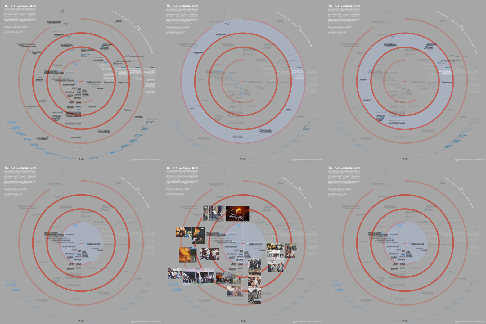
This immersive prototype was made for my Data Visualization and Information Aesthetics course taught by Professor William Bevington in Fall 2018. I chart the hourly timeline of the LA Riots as recorded by the Los Angeles Times while including photos from the photojournalists who risked their lives to capture the chaos. The names of those who died during the riots is listed and memorialized on the bottom by day of death, which includes how they died and where their body was found, as investigated by the Los Angeles Times. This then became my thesis, which is now available to explore on my GitHub, linked in the images. This is not fully functional, but a prototype.
Care and Maintenance
This project is fully functional for the chairs included. In this, I cover the care and maintenance of a partial collection of chairs designed by Charles and Ray Eames that are sold by Herman Miller. A crucial part of owning these special (and expensive) chairs, this project highlights the true, untold cost of owning a piece of practical art.
Television Habits
This project uses self-collected data from our custom-built Particle board using two sensors at random. I was given the tilt sensor and IR sensor which I combined to measure when and how I am watching the television in my living room that has a futon in between the TV and the dining table. If the futon is down, then it is more likely I am multi-tasking while watching TV, as opposed to when the futon is up, I am likely sitting on the futon focused on the TV.
True Tuna
This poster was created for the Information Aesthetics and Data Visualization course at Parsons with the requirement of creating a design using data from a taxonomy. I chose to create it on the a specific class of tuna called the True Tuna (Thunnus) which consist of 8 fish—coincidentally fitting perfectly in this 3x3 grid leaving the center for information and a legend. This is ideally viewed in a 40" x 40" print. The typography, composition, and colors were very meticulously designed as that was the main focus of this final submission.


